
Michi method · 7 min read
Michi Method Pokémon Binder: A Practical Guide
Learn how to plan a Michi method Pokémon binder page with hero cards, art panels, and intentional empty space before you print.
The Michi method is a way to arrange a Pokémon binder page as a composition instead of a checklist. You choose one or two hero cards, give artwork room to span multiple pockets, and leave some space empty on purpose. This guide explains how to plan a Michi method Pokémon binder page before you print anything.
The name was popularized by @peeplop and is credited by woahpoke's guide. It is not a strict standard with one correct grid. That is useful: the method is a way to make a page feel intentional, not another rulebook for collecting.
Start with one visual decision
A normal set page usually answers one question: which card number comes next? A Michi page answers a different question: what should the page feel like when you open the binder?
Choose one starting decision:
- A Pokémon you want to show across different sets or artists.
- A trainer and the Pokémon associated with them.
- A colour palette, scene, or small story.
- One hero card that deserves space around it.
- A piece of artwork that can carry two or more pockets.
This decision is the page's anchor. The other cards and inserts support it. If every pocket is competing to be the focal point, the page usually becomes busy even when the cards are individually good.
The empty pockets are not unfinished work in this plan. They are space that can later hold an insert, a second card, or nothing at all.
Layouts that are easy to start with
Anchor page
Put one strong card or a two-pocket art panel near the centre, then arrange supporting cards around it. This is the simplest layout because it gives you one clear priority. The supporting cards can share the Pokémon, artist, colour, or scene without needing to match perfectly.
Single-Pokémon page
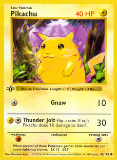
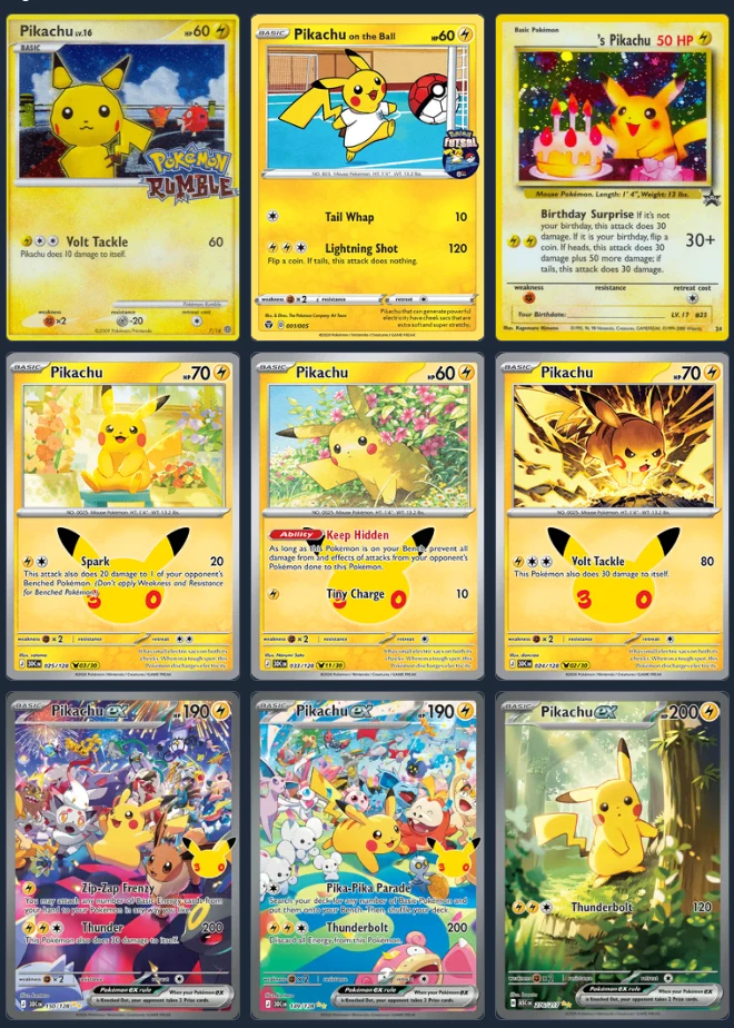
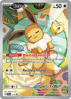
Choose one Pokémon and let the page follow it across sets, artists, and eras. Eevee, Pikachu, and the original starter lines are common choices because there are enough different illustrations to make a page feel varied. A single-Pokémon page does not need every card. Pick the illustrations that make the page read well together.
Themed or story page
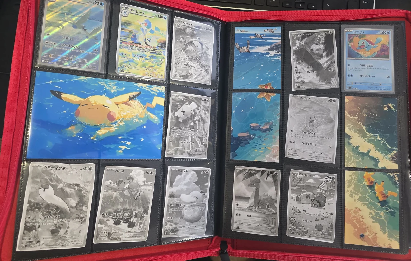
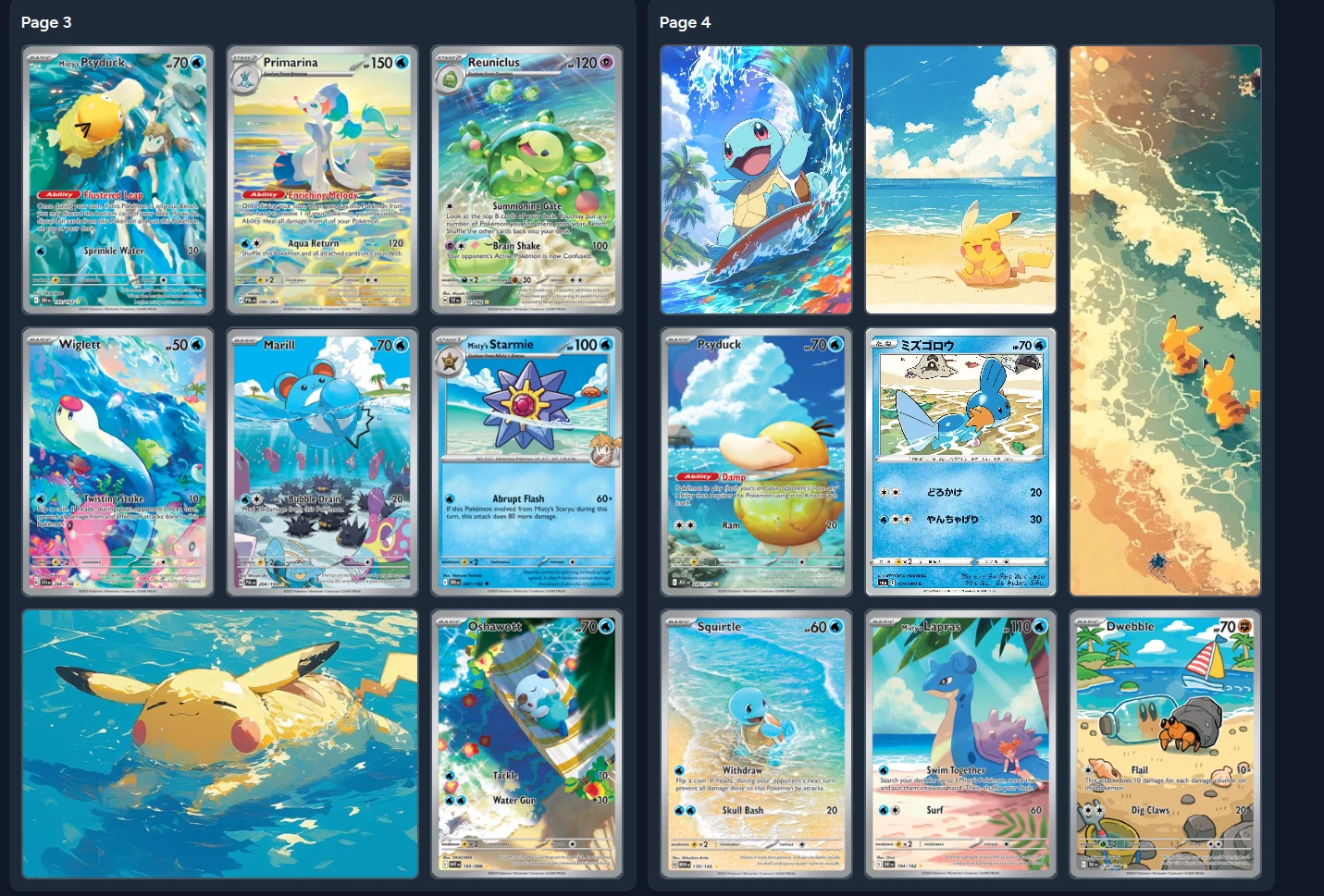
This is the layout I have tried. My page has a beach-and-underwater theme, with water artwork, swimming Pokémon, and cards that fit the same atmosphere. The page is already printed and in my physical binder.
The practical result is simple: when I buy a card for this page, I know exactly where it goes. The page is not only a display; it is also a map for the next cards I want to find. Choose the theme first, then reject cards that weaken it even if they would complete a cleaner checklist.
Artist page
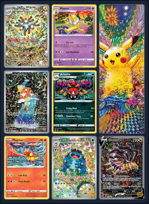
Group cards by illustrator. A recognisable line, palette, or way of placing a Pokémon can hold a page together even when the subjects are different. This is also a good way to discover which artists you want to collect next. Use the artist credit in your card catalogue rather than guessing from the image.
Trainer page
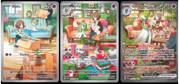
Build around Misty, Erika, N, Cynthia, or another trainer. Combine trainer cards, their signature Pokémon, and inserts that place them in the same visual world. The page becomes a small character collection rather than a list of cards from one set.
Full-page artwork
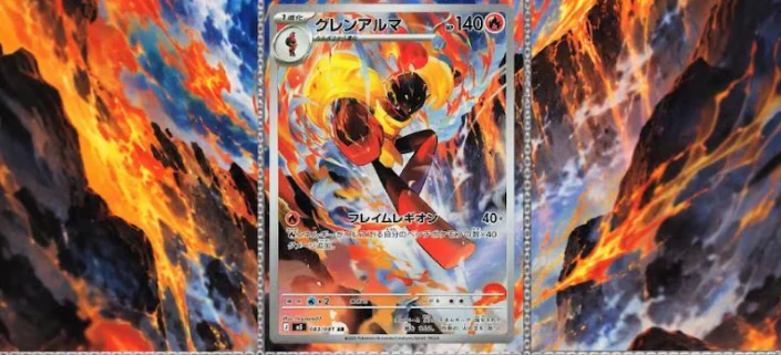
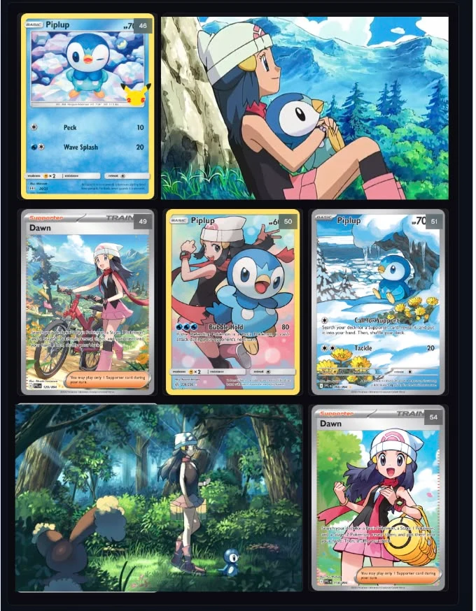
Use one large image as the page's background or as tiles across several pockets, then place a few cards over it. This is the strongest visual version of the method and the one most likely to punish a small sizing error. Test the crop digitally before printing. Keep faces, text, and other important details away from pocket seams.
Plan before you print
The physical version of a Michi page is slow to revise. You need to choose the artwork, crop it, print inserts, cut them, sleeve them, and place them in the binder. A digital plan makes the reversible decisions happen first.
Use a 3×3 page as a simple starting canvas:
- Place the hero card or panel.
- Add the cards that support the theme.
- Leave the remaining pockets empty temporarily.
- Try one or two insert crops in those spaces.
- Look at the whole page at a distance, not only at each pocket.
- Print only after the composition still works without one of its optional inserts.
Pokébinder (pokebinder.xyz) is built for this planning step. Search for the cards, move them into nine-pocket pages, add your own artwork, and test a span before committing to paper.
My first test was a two-page beach-and-underwater spread. The digital version gave me a place for each card and artwork panel before I opened the physical binder. The physical result was not identical: I changed parts of it after printing and placing the cards. That is the useful boundary between the two steps. The app is the plan; the binder is where the page becomes yours.
Size the insert for the pocket
The card and the pocket are not exactly the same rectangle. A Pokémon card is commonly described as about 63.5 × 88.9 mm, while the pocket around it has extra room. The exact pocket varies by binder, so measure your own pages before producing a full set of inserts. The sizing tables in the WoahPoke guide are a useful starting reference, not a replacement for that measurement.
For artwork that spans pockets, think in pocket rectangles rather than card rectangles. A two-pocket horizontal panel is wider than one card, and a 2×2 panel has its own crop. Keep the important part of the image away from the seams. If the image contains a face or text, make a test print of one panel before producing nine tiles.
Print at 100 percent scale. A printer setting such as “fit to page” changes the size and can make an insert look correct on screen but sit loose in the pocket. Matte cardstock is usually easier to read than glossy paper under binder lighting. The right weight depends on your printer and pocket, so test one insert before buying a large pack.
Choose the binder around the layout
Side-loading pockets are usually the easiest fit for this method. They keep cards and inserts in place when a page has intentional gaps, and facing side-loading pages make cross-page artwork easier to plan. Top-loading binders can still work for single pages, but they do not give the same behaviour across a spread.
Start with one page. A single finished page teaches more than an ambitious binder that has ten half-planned pages. Once the page works, reuse the decisions that made it coherent: one focal point, a limited palette, a clear crop, and enough space for the eye to rest.